How to pull a report
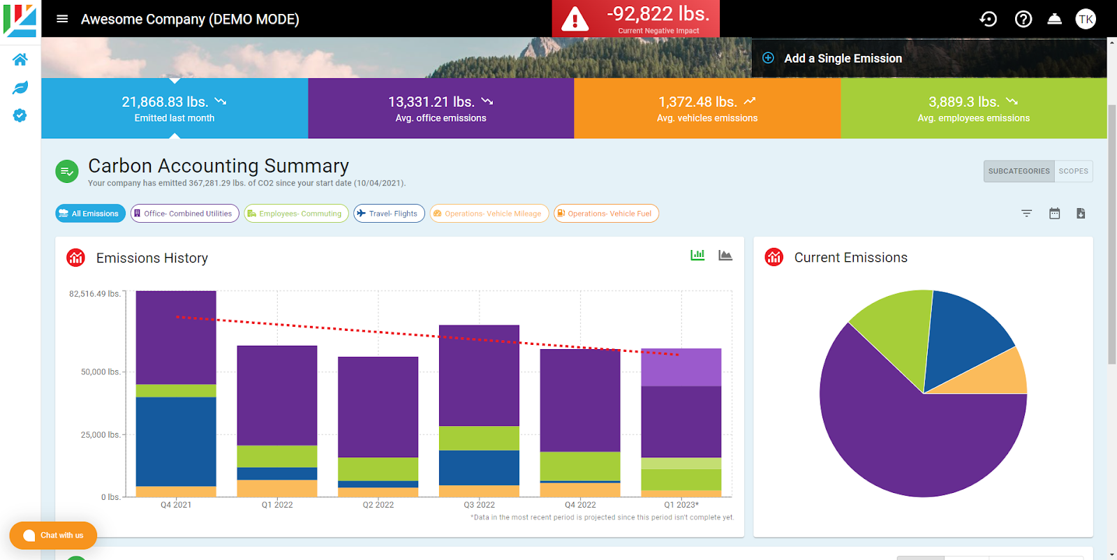
In Aclymate, there are few different ways to visualize and extract the useful emissions data you need for your own reporting purposes. When viewing the main Dashboard you'll see a breakdown of your emissions by category (bar graphs) over time, and on the right, a pie chart to give you a top down view of where categories your total emissions are coming from.
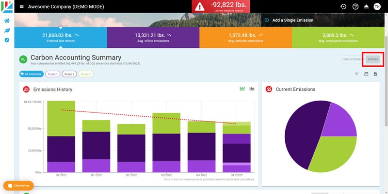
To view your emissions by individual Scopes, simply select the Scope view above the pie chart on the right hand side:
Filters, Calendars, Downloads
Above the pie chart you'll notice a few buttons: Filters, Calendar, and CSV Download.
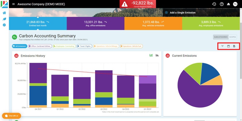
Filters will allow you to filter out your results by vendor, employees, offices, and vehicles. The calendar function allows you to view emissions within a certain date range. To download the data to a CSV file for a more in-depth analysis of emissions click on the 'Download Emissions CSV File' button
Related Articles
Reporting- How to Generate and Interpret Your Emissions Report
Aclymate’s reporting feature lets you generate yearly and quarterly specific emissions reports and then interpret each section to satisfy frameworks like SBTi, CDP, Ecovadis, B Corp, and more. This two-part guide walks you through generating the ...Accounting- How to get the data I need out of my accounting software?
Vendor & Purchasing Information Much of your company's carbon footprint comes from the products and services you buy. Here's what we need: You have two options: Option 1: Connect your QuickBooks Online account directly in the Aclymate app. Option 2: ...MyAclymate- The personal carbon accounting tool
What is the myAclymate Survey? Before you can receive your impact report, we invite you to fill out the myAclymate survey, a fast and easy carbon footprint calculator designed to ask you a series of questions that will help us accurately estimate ...Turn-Key Services
Turn-Key Services- What is it? At Aclymate, we recognize that even with a streamlined, easy-to-use tool at your disposal, time is still an important factor to you. That is why we offer our Turn-Key Services- a service set up to help you get your ...Event Calculator
Almost every business hosts some type of event, whether it's the annual Holiday party, or a company offsite. Now, with Aclymate, you can measure the impact your event has using our events tool. To create a new event, click on the podium in the left ...